Widgets, input and presentation
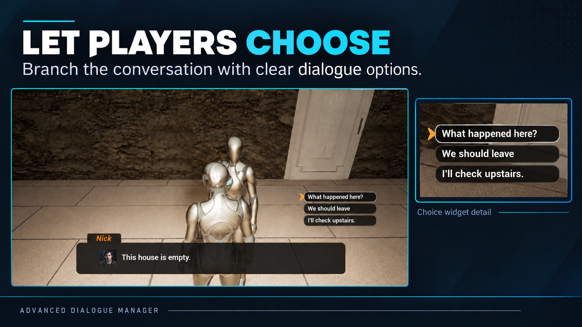
Widgets, input and presentation. Supplied product gallery image; any captions/overlays are promotional, not interactive controls.
Derive your main Widget Blueprint from AdvancedDialogueWidgetBase and each response entry from AdvancedDialogueChoiceWidgetBase. Their Designer layout is yours: choices can sit beside the dialogue text, provided ChoicesPanel belongs to the main widget.
Where to find widget settings
Section titled “Where to find widget settings”In the main Widget Blueprint, open Class Defaults and use these Dialogue / UI groups:
| Group | Settings |
|---|---|
| Choices | Choice Widget Class: the response-entry class, not the main widget |
| Input | Automatic focus, keeping focus inside dialogue, navigation cursor behavior |
| Visibility | Collapse the whole widget when dialogue ends |
| Speaker | Apply the Speaker Asset color to the displayed name |
| Continue | When to show Continue and whether its hidden layout preserves space |
| Text | Typewriter reveal, timing, skipping and punctuation |
These affect the supplied widget only. Continuation timing belongs to the Dialogue Component or its asset/line overrides. The game still owns the Player Controller input mode.
Optional automatic bindings
Section titled “Optional automatic bindings”| Main widget control | Type | Purpose |
|---|---|---|
| SpeakerNameText | Text Block | Resolved name and optional speaker color |
| DialogueLineText | Text Block | Plain line text |
| DialogueRichText | Rich Text Block | Preferred over DialogueLineText when both exist |
| SpeakerPortraitImage | Image | Expression/base portrait; collapses if none |
| ChoicesPanel | Panel, e.g. Vertical Box | Hosts generated choice widgets |
| ContinueButton | Button | Calls widget confirmation |
| ContinueHintText | Text Block | Device-specific confirmation hint |
| InputHintIcon | Image | Configured input-device icon |
Choice entries optionally bind ChoiceButton, ChoiceText, DisabledReasonText and ChoiceSelector. ChoiceSelector can be any widget used for highlighting, such as an Image or Border. The main widget needs both ChoicesPanel and Choice Widget Class to generate responses.
Confirmation and typewriter
Section titled “Confirmation and typewriter”Advancing a line versus revealing its text
Section titled “Advancing a line versus revealing its text”- Continue Mode (component, asset or line override) decides when the runtime advances.
- Allow Early Continue permits the player to advance an automatic line before its timer or voice finishes. This is the display label of the existing
bAllowManualContinueproperty. - Allow Typewriter Skip (widget) lets confirmation reveal unfinished text; it does not itself advance the line.
- Show After Typewriter changes only when the Continue button appears, not when an automatic line advances.
Line Duration is the display label of the existing Duration setting. With After Duration, the timer begins when the line starts, not when the typewriter finishes. Auto Continue Delay adds a wait after that duration. For example, 3 seconds plus 0.5 seconds gives 3.5 seconds before automatic continuation, excluding dialogue pause.
After Reading Time estimates display time from Reading Speed (Characters / Second), within the minimum/maximum limits. This is separate from the widget’s typewriter speed. Details already filters continuation fields by the selected mode.
Use Confirm Dialogue Input for player input. With Allow Typewriter Skip enabled, confirmation reveals unfinished text; a later input advances if the runtime allows it. With skipping disabled, confirmation does nothing until reveal finishes.
Typewriter is disabled by default. Fixed Speed uses characters per second. Sync To Voice uses usable voice duration, falling back to fixed speed; punctuation pauses apply to the fixed-speed fallback.
Typewriter timing and automatic line timing are separate. A fast automatic line can end before a slow reveal completes; configure both intentionally.
Continue button
Section titled “Continue button”| Setting | Meaning |
|---|---|
| Use Dialogue Settings | Show for manual lines; hide for automatic ones |
| Always Show When Allowed | Also show for skippable automatic lines |
| Show After Typewriter | Wait for full text; show immediately if typewriter is disabled |
| Always Hide | Hide the button; manual dialogue still requires another input route |
Runtime availability still applies: hiding or showing a button does not override choices or pause.
Continue Button Hidden Layout defaults to Hidden, which reserves space. Collapsed removes its space and can make the dialogue panel shrink.
Use Speaker Color for Name defaults to true. Disable it to retain the Designer text color; graph accents remain independent.
Input ownership
Section titled “Input ownership”The widget supports focus/navigation and input hints, but your game configures Player Controller input mode and movement restrictions. Avoid sending one press through both the widget and component.
Set Dialogue Component binds/refreshes presentation; passing null detaches it. It does not start/stop the runtime. Custom UI should use On Dialogue Line Started and On Choices Requested, and dispose of stale choice indices when presentation changes.